Despite the impossibly long list of features and settings in Microsoft’s Excel, the most popular spreadsheet suite still lacks some features that seem trivial, or they require complicated workarounds and possibly some knowledge of VBA. One omission that annoyed me several times is the fact that in XY scatter (and bubble) charts you can’t automatically label data points with text from a third column; it’s only possible to show the value of the X or Y point. Until recently, custom labels required either a lot of manual work to change the default text, which was not sustainable for large amounts of data, or the use of macros or third-party add-ons. But, while working on the chart for my previous article, I discovered that, at least in Office 2013, this option has finally been added to the user interface!
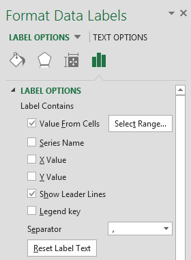
 It’s still a little buried under the wealth of chart options, so here’s how you can find it: first set up the chart and make sure you have turned on data labels. Then select the data labels for the series where you want to change to custom labels and open the formatting pane (right click and choose ‘Format Data Labels…’). Another way to find this panel is to select the chart, then go to the tab ‘Design’ in the Office ribbon, click the menu ‘Add Chart Element’ ► ‘Data Labels’ ► ‘More Data Label Options…’. Once here, select ‘Label Options’, check the first box, ‘Value From Cells’ – and optionally uncheck the rest to keep labels from becoming too large and hard to read – and finally use the button ‘Select Range…’ to add the range of custom labels to the chart.
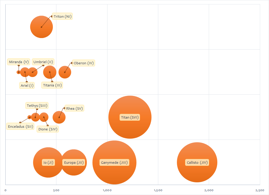
That’s it, no more manual workarounds, just a couple of clicks and charts can become much clearer for readers. I’m assuming the range for labels should have the same number of cells as the ranges of the X and Y data. If you don’t need to label the entire series, you can leave some blank cells in the label range, these are ignored when Excel draws data labels. You can see an example chart below, a slightly modified version of an illustration for an older article.

31 comments:
Is there a way to hide these labels, so they appear when you hover over it or click on the bubble? Thanks!
It's not possible directly through the chart options, only if you use macros/VBA code. Here are some examples: Interactive Chart in VBA using Mouse Move Event and How to use a macro to add labels to data points in an xy scatter chart.
Finally, after so many years and version, this very usefull feature has been include. However, it has one unpleasant consequence - when opening such a graph in older versions of Excel (2007, 2010), the labels disappear. Is there any way around it?
I'm afraid not: since the feature was only added in Excel 2013, previous versions don't "understand" it and simply discard that information from charts.
It seems that it is not possible to modify the labels in the hover fields. It would have been nice to use the new excel feature to assign the labels, and then when the labels are turned off, that the assignment would still hold for hover mode.
I have a scatter plot with thousands of entries. I just want to hover over the outliers to determine which they are. ... :( it doesn't seem to be possible.
Hello!
Please try 5dchart Add-In for MS Excel. It has the option to show and hide labels for every bubble, and many other features.
The link is http://5dchart.com
Good luck!
Disclaimer: I am the author of 5dchart Add-In.
Why can't I find 'series lablel' under 'Label contains' or even 'Value From Cells' in Excel 2016 for Mac
I have no experience with the Mac version of Excel, so it's possible this feature isn't available there. I can confirm that the Excel 2016 for Windows works as described in the blog post.
I noticed however that the option is not available with older Excel file formats, so you should convert to the latest .xslx format.
If you want an out-of-the-box solution and you have Excel 2013, you can now benefit from the various apps that are published in the MS Office Store. For example, the yellohcharts app has build in hover over menu for each data point. If you go to https://store.office.com/appshome.aspx and search for the Yellohcharts app, you can try it for free...hope this helps.
Make sure you save as .xlsx. I am using Excel 2013, but my default is .xls (for backward compatibility) and the option did not show until I saved as .xlsx and reopened it.
I had to save as .xlsx and reopen before this option would show in the menu. I am using Excel 2013, but my default format is .xls for backward compatibility.
If it makes a difference, I am using scatter plots (Y vs. X) and labeling occasional points using entries in a third column. I have not checked other plot types. The range for labels can only be specified as the complete column. You cannot select just a portion of the column. Here's the confusing part. The first cell in the label column will be associated with the first point plotted regardless of the row of that point in your actual plot. The labels will only be on the same row as the associated data point if your x y data start at row 1. Very strange! But at least we have this option to put labels in another column.
Oh, there is also a limit of 1000 labels. I assume that includes blank labels, meaning any label past row 1001 will be ignored. I haven't tested that.
I was looking for exactly this - Great post! Thanks a lot.
This option "Values from Cells" is missing in Excel for Mac. Anyone have any suggestions? Thanks!
The option "Value from Cells" is missing in Excel for Mac. Does anyone have a workaround for adding the labels? Thanks!
What version of Office do you use? Since the feature has only been added to Excel in version 2013, Mac Office will probably get it only in the current version 2016.
Most recent version doesn't have it. I think MS intentionally makes the mac Office suite harder to use to dissuade people from using macs. There are dozens of these type of features only available on a windows PC and make me dislike MS.
A "rough" work around only for small charts... if you click on one dot and say "Add Label", a label will be added. That label is then EDITABLE, you can type in whatever you want. If you drag the label away from the dot, it makes a little connector line. Not ideal, but could help get you through.
A rough work around is to manually add labels. Click on a dot, right click and select Add Label. Then that label is EDITABLE and you can make it whatever you want. Not ideal but may help you out. Also, if you drag the label away from its dot, excel draws a light connector line.
abundantegrande and Brandy, you can use macro to add labels automatically. The instructions are here: https://support.microsoft.com/en-us/kb/213750. They are for Windows, but worked for my Excel 2016 for Mac - just followed the instructions. You can find Macro under the "Tools" menu. Good luck!
Thank you man. This really helped me at work.
All of a sudden this option is missing from Label Options... anyone else having this problem?
It's still there for me.
Thank you also for me! The explanation is very clear and well written.
Thank you also for me! The explanation is very clear and well written.
me too. thank you
I'm using Office 2016 -- that Label Option is NOT there.
I was able to individually label points in the plot until yesterday morning. Now however, I can only label all or nothing. I have restarted the computer multiple times but still nothing. I'm using excel 2016. When I only highlight one dot it doesn't give me the option of "Value from Cells" anymore.
I have about 1300 dots, so I only want to label some of them. Anyone any ideas what is going on?
I was able to individually label dots in my plot until yesterday. Now however, I can only label all or nothing. I'm using excel 2016. When I highlight only one dot I don't have the option of "Value in cell" anymore. I have about 1300 dots in my plot, so it gets very messy if all of them are labeled. Any ideas what I could do and why it may have changed?
I found this very useful - in fact, exactly what I wanted. However, I then wanted to save the Excel worksheet as a template for a class of children to use, and when I saved it(as either just an Excel Template or as a Macro enabled template)the labelling of the dots in the scattergram disappeared. Hey ho!
Thank you! You have saved me hours and hours of work. 3am ... now to sleep!
Post a Comment