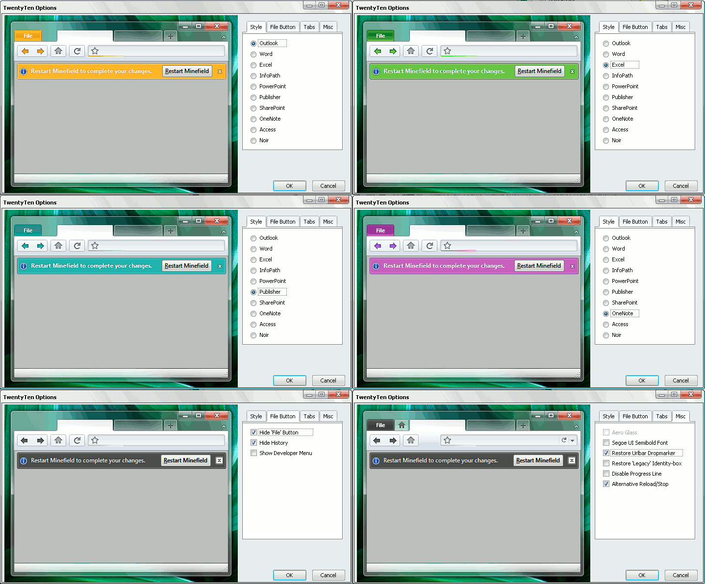
After making a small step to refresh Firefox’s looks by hiding the old-fashioned menu, I made a bigger step by changing the whole theme. I found something very similar to the recently presented proposals for the upcoming interface of Firefox 4.0. There are lots of tutorials on the web about making the current version of Firefox look as close to this concept as possible, but they all involve several steps, more than one extension and tweaks to configuration files. This theme on the other hand makes the switch easier.
The theme is called “TwentyTen” and can be found on deviantART. It’s inspired by the Office 2010 design, hence the name, and includes a different color theme for every Office application, plus a ‘Noir’ setting, for a total of 10. Since the recent UI concept for Firefox on Windows is also inspired by Office, the theme comes pretty close to both.
I personally love how it looks, although on Windows XP it doesn't benefit from any Aero effects. I usually go with the default browser look and lately Firefox was very behind compared with Chrome and Opera 10. And yes, the interface makes a difference, whether we like to admit it or not. The interface was the main reason I didn’t like to use the previous versions of Opera. Now, with this theme installed, Firefox has a chance to compete and I find myself using it more and more instead of Opera.

The installation file also adds an extension to Firefox, “TwentyTenBuddy”, probably required for the deeper changes to the interface and to manage the options. So if you ever go tired of the Office looks, don’t forget to uninstall or disable both the extension and the theme.

I have no way to test it and haven’t found anything explicit, but I think the theme is Windows only. The German blog where I discovered it also mentions some incompatibilities; probably the most important is with Tab Mix Plus, a very popular extension to tweak the tab behavior in Firefox. They propose the weird-named TabberWocky as a lighter alternative.
As a final note, I also recommend using the Fission extension to move the progress bar inside the address bar and a CSS-trick to merge the Stop and Reload buttons. The theme works without them, but this way it’s more streamlined and eye-catching.
Post a Comment