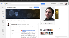
The big Google news today seems to be a fresh new design for Google+. The main change is a customizable, dynamic ribbon of applications
on the left. The look of individual posts has also been updated along with the +1 buttons, share counts and comments. Most people like it, others don’t – including me. Let’s have a go at it one section at a time:
Home

At some point I noticed that the rightmost side was reserved for the Chat widget, when open. When you maximize your browser window, the same Chat widget will become a fixed, full-height, sidebar. So much for customizability! Maybe I want to use my browser window for something else or – crazy, I know! – maybe I am logged out of chat completely, while at work for example. Does this thing have to take up space if I don’t use it?! Not to mention this design copies the behavior of the Facebook chat sidebar almost identically.
Speaking of customizability, why can’t you choose which circles are featured on the ribbon above the posts? Suddenly Google+ is focusing on ‘Friends’ and ‘Family’ while having a ‘What’s hot’ public section as well?! Is the focus on personal, intimate relationships or public sharing? You can’t be both at once.
Update: It seems changing the two default circles used as stream filters is possible, just hard to discover: go to Circles and drag two of them to the top left, next to the dummy circle with the tip. The order here is the same as in the stream filter menu.
Photos

Even more wrong in the new design: there are no more ‘Photos from your circles’! Compare that to what you get the first time you visit Facebook: a stream of photos from friends. Based on this, you could say Google has abandoned the idea of a social network altogether – since it can’t even show you photos posted from your connections.
Profile

The white space for Chat makes a comeback; curiously, on ‘Photos’ there is no space reserved for Chat, so it overlaps them – there goes the consistency as well.
Circles

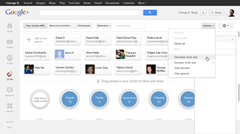
The big mystery here is the huge light-grey ribbon on the bottom of the screen. Did someone thought the new design needed to waste even more screen space?! Curiously, it disappears if you drag the line separating contacts and circles, so it could be a bug in Chrome. But that only begs the question – again – does anybody tests these things before releasing them?!
@exde601e Yes, because the iPad version of Google Plus is still in iPhone format :)
— Thomas Baekdal (@baekdal) April 11, 2012
Last but not least: I saw someone saying you can’t reorder stuff in the left sidebar on Facebook. That's not actually true: except for ‘News feed’, you can define ‘Favorites’ that will go in the top section immediately below ‘News feed’. The other sections display your most recently used items – in a way better, since the interface learns from your choices instead of making you work to define them.
So, the bottom line? Google is copying the design choices Facebook made in the past and making new usability mistakes of its own. Sounds like a winning hand to me…
Post a Comment