This is the one feature that may seem the least “basic”, but it really is essential. There’s so much good content available today that we need our apps to help us keep track of it all, not just what we’re currently watching. If state preservation and visual communication are the app’s short-term memory, then “My List” is the app’s long-term memory.
This is a pretty boring list, huh? A streaming app with only these features seems like it would be quite limited. But the sad fact is that few, if any, popular streaming apps reach even this extremely low bar. Let’s take a look at some examples.
But none of this changes the overall picture, which is that even the most popular, well-funded streaming video apps fail to get the basics right in a shocking number of ways. Conflicting incentives surely explain some of these failings (e.g., promoting new content rather than letting me quickly resume what I was already watching), but an explanation doesn’t make these shortcomings any less bothersome.
John Siracusa
Interesting critique on the design of streaming apps. I agree with most of these bare-bones basics listed by the author – maybe except for his insistence on one-click access to subtitles; I always watch TV with subtitles on, so the only time when I need to access these controls is when I start a new series without Romanian subtitles, and I need to decide which other language to choose.
Resuming where the user left off is a widespread issue; for the longest time Netflix used to shift around the ‘Continue Watching’ section each time I opened the app, so I had to scroll back and forth to find it. Presumably they did that to incentivize people to check out new shows, but it was annoying and thus a poor user experience. HBO Go was an absolute mess on many levels: sometimes forgetting what series you just watched, or launching a new episode towards the end instead of the start, regularly wiping your watchlist… HBO Max seems to have fixed these glaring issues, though it was launched in Romania barely a month ago, so maybe I haven’t stumbled into its less polished zones yet.
One area that could use a lot of improvement in most streaming apps is ‘My List’. In Netflix at least, my watchlist has constantly grown over the years, and trying to browse it is a massive struggle. There are no filters, no sorting controls, or any indication in which order the shows are displayed, nothing to distinguish shows that you have already watched from those you haven’t started yet. I would like, as a bare minimum, to be able to hide shows I have finished – you could certainly remove them from the list, but that kind of defeats the purpose of having a personalized list, as you may want to watch them again or be reminded when new seasons arrive. I would get better results by manually keeping track of them in a spreadsheet…
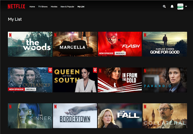
HBO Max at least differentiates between series and movies, though that doesn’t help a lot. What I find even dumber is how Netflix continues to recommend shows that you finished inside its homepage categories – thanks, I’m aware that’s a crime show, I just watched it a week ago; how about showing me something new?! One might hope that the increased competition in the streaming space would push companies to improve their apps and user experience; so far, I see little evidence of that.
Post a Comment