Excess mortality is calculated as the difference between the number of deaths that have occurred and the number that would be expected in the absence of the pandemic based on data from earlier years.
Excess mortality includes deaths associated with COVID-19 directly (due to the disease) or indirectly (due to the pandemic’s impact on health systems and society). Deaths linked indirectly to COVID-19 are attributable to other health conditions for which people were unable to access prevention and treatment because health systems were overburdened by the pandemic. The estimated number of excess deaths can be influenced also by deaths averted during the pandemic due to lower risks of certain events, like motor-vehicle accidents or occupational injuries.
Most of the excess deaths (84%) are concentrated in South-East Asia, Europe, and the Americas. Some 68% of excess deaths are concentrated in just 10 countries globally. Middle-income countries account for 81% of the 14.9 million excess deaths (53% in lower-middle-income countries and 28% in upper-middle-income countries) over the 24-month period, with high-income and low-income countries each accounting for 15% and 4%, respectively.
The estimates for a 24-month period (2020 and 2021) include a breakdown of excess mortality by age and sex. They confirm that the global death toll was higher for men than for women (57% male, 43% female) and higher among older adults. The absolute count of the excess deaths is affected by the population size. The number of excess deaths per 100,000 gives a more objective picture of the pandemic than reported COVID-19 mortality data.
Technical Advisory Group on COVID-19 Mortality Assessment
Tracking excess mortality as a consequence of the coronavirus pandemic is an important tool for assessing various health measures and their effectiveness. This study however arrives at some questionable conclusions and has been discussed critically on Twitter.
Some publications have jumped at the opportunity to once again hail Sweden’s terrible pandemic response with titles such as: ‘Sweden’s Covid death rate among lowest in Europe, despite avoiding strict lockdowns’. That conclusion is in itself a blatant cherry-picking of the data; it’s obviously meant to imply that ‘lockdowns don’t work’, but if you look at the graph included in the article, countries such as China, Australia, and Japan, actually had negative excess deaths, meaning less deaths in 2020 and 2021 than expected. What do these countries have in common? Much harsher lockdowns in Australia and China than anything we had in Europe, and in Japan a near-total border closure, which it hasn’t yet fully lifted. Clearly lockdowns and travel bans do work to contain infectious diseases, despite so many people loudly and actively denying it.
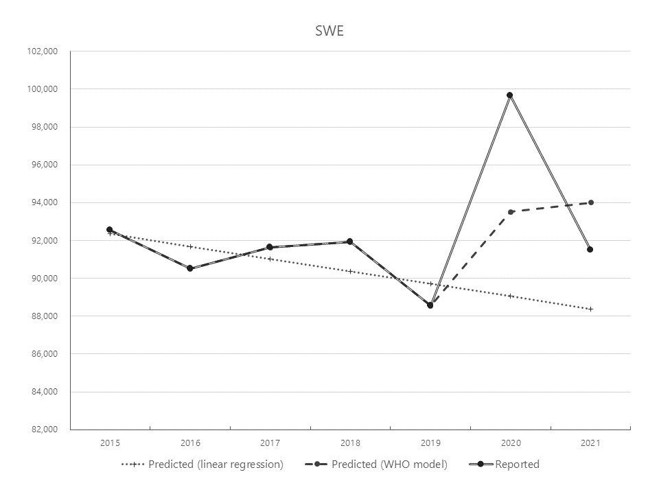
But digging into the figures raises more questions about the methodology behind the study. Recognizing a trend in a short-term data series (the model uses mortality in the previous five years only, 2015 to 2019) and extending it for two more years into the future is naturally a tricky practice that can ignore many underlying factors and lead to faulty predictions. According to the papers (available here and on arXiv.org), the model fitted available mortality numbers using splines, which can be very sensitive to small variations in recent data. The results are mixed, as you might expect. If you graph WHO’s predicted deaths alongside historical data, for most countries it looks like a reasonable extrapolation – until you get to Germany and Sweden…
The WHO fit for Germany predicts a continued drop in mortality for 2020-2021 in the absence of the pandemic, apparently based solely on the decrease of 2019 compared to 2018. Anyone looking at the chart would most likely guess a slight increase or at best a stagnation based on the 2015 to 2019 trend. Sure enough, a linear fit of those five years points to a minor increase for the next periods.

Sweden’s case is even more dramatic. The trend from 2015 to 2019 is clearly downward – and yet… the WHO somehow expects a rising death rate for 2020 and 2021, with numbers higher than any of the past five years! I find it hard to grasp how any impartial mathematical model would produce this forecast.

To their merit, the authors of the paper revised the estimates for Germany and Sweden after people pointed out these discrepancies, and the results are more plausible and closer to other independent estimates (a surplus of 122K for Germany and 13.4K for Sweden in absolute terms, or 145 per 100.000 inhabitants for Germany versus 133 for Sweden – not much of a difference after all). But the question remains: why did they not check their predictions before publishing the results? They even state that the spline model was fitted separately for each country
– a simple plot would have immediately revealed the issues just by ‘eyeballing’ it. It took me just half an hour to put together an Excel chart, including the simple linear regression that fits the data better than WHO’s spline model. And by the way, the original estimates are still on the WHO website, which is where I got the numbers for my charts, with no indication of a correction.
Wie auch immer, der zeitliche Trend zeigt etwas Wichtiges, das durch EuroMomo bestätigt wird: Bei den großen europ. Ländern ist Deutschland das einzige, dessen Übersterblichkeit sich von 2020 zu 21 nicht verringerte. Und das Land, das die erste Welle am besten kontrolliert hat. pic.twitter.com/YqklABbIfz
— Christian Drosten (@c_drosten) June 10, 2022
Slip-ups like these raise questions, at best about the WHO’s competence, at worse about its bias in interpreting the data. With the prospect of more pathogens spreading faster and wider in the future, we need a World Health Organization with the strength and will and the correct policies to tackle the challenges, not one who mindlessly repeats that travel bans don’t work and who publishes flawed studies supporting false narratives.
Post a Comment