It’s all fine and dandy that you can bring the Sidebar up, but what can you actually do with it? The Sidebar is a panel on the right-side of Edge that houses tools, shortcuts, and websites. By default, it includes Apps for search, discover, tools, games, Microsoft Office, and Outlook. You can toggle any of these on or off. Some of them, such as tools, allow further customization.
When I write news articles, I often have to convert units, so I have the tools app in the Sidebar show a calculator and a unit converter. The tools app also has a translator, dictionary, and world clock.
The Office app in the Sidebar shows your recent documents and shortcuts to create a Word, Excel, or PowerPoint document. Outlook, as you’d expect, shows your emails, calendar, contacts, and to do list. It’s basically the mobile version of Outlook, just housed within a panel.
If you aren’t completely in the Microsoft ecosystem, the default apps within the Sidebar won’t be that useful. Thankfully, you can pin any site you’d like in the panel. You can swap between the mobile and desktop versions of most webpages, though I’ve run into some that don’t support switching, such as the mobile version of Gmail.
Sean Endicott
The Edge sidebar has come quite a long way since I first discovered it in the dev version in the first half of the year. The Tools panel has been expanded with new widgets: a Dictionary, a Translator, and a World clock – nothing groundbreaking, as users can easily find definitions by searching the web, and a translation feature was already available in the context menu (also more convenient to use in my opinion, as you get instant result without having to copy the text and open the sidebar).
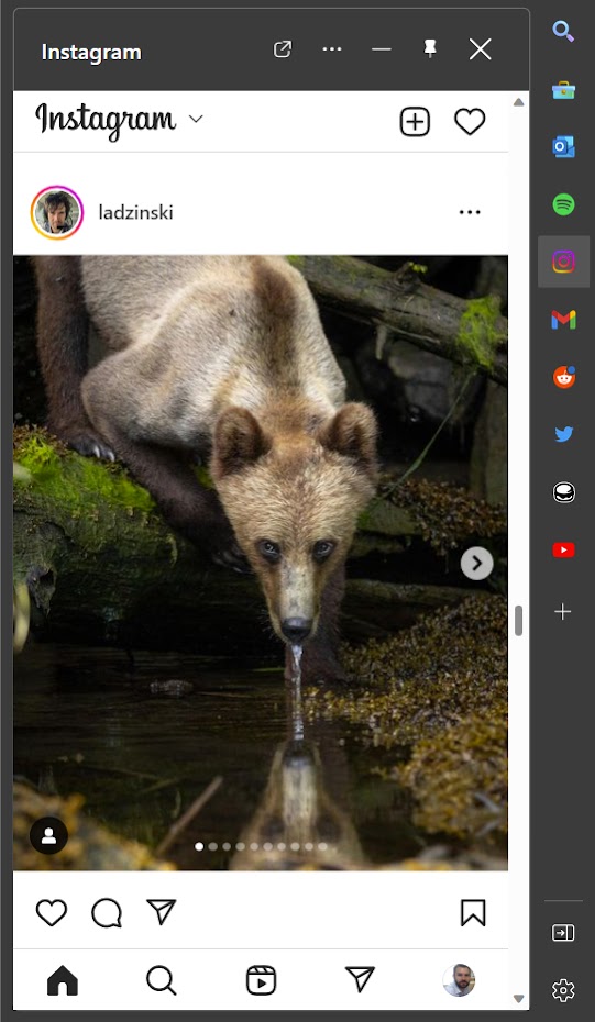
The more interesting aspect of the recent sidebar updates is how you can now add basically any webpage to quickly check it for updates. I added a couple more popular sites; there are still some quirks here and there, but overall a fine experience for the limited space of a sidebar. You can ‘pin’ the side panel to keep it permanently open on the right side of the screen, or unpin it, so it collapses automatically while you’re not interacting with it. The sites that work best are those with solid responsive designs. You can comfortably load Twitter, reddit and Instagram this way, browse the feeds and interact with almost no restrictions; Feedbin also works great in a single-column layout.


Other sites default to a mobile version and look uglier and out of place, at least to me; Microsoft’s own Outlook and Gmail both load in this manner, and so does my own blog. What I miss most here is the lack of a dark mode, contrasting strongly with my dark browser UI.
Spotify is a curious case; its panel is considerably larger than others, occupying over half of a maximized browser window, but it also has extra functionality. As long as the sidebar is minimized to the side, not fully hidden, you can hover over the Spotify icon to reveal a minimal set of controls for music playback. This works with YouTube’s site as well while videos are playing. The issue with Spotify’s extra-sized panel can be partially fixed by unpinning the app, so that the side panel opens on top of the current site instead of forcing the horizontal viewport to shrink. Apparently, you can also resize the panel down to a more manageable size – but doing so crops the Spotify UI in a weird way, losing direct access to many controls.
Speaking of media controls, I noticed Edge has an experimental flag for this, which you can enable under edge://flags/#edge-global-media-controls. It seems to mirror Chrome’s similar feature, down to the icon used in the browser toolbar, with the added benefit of a button for casting content to another device. Personally, these controls seem more practical than the gimmick of using a sidebar app for the same purpose, especially since the content in the sidebar doesn’t register whether you have the same website opened in a regular tab. You can easily end up with multiple things playing in parallel, wondering where each of them is coming from.
To close off the article with a dose of criticism, as in previous posts, I dislike some of the recent changes to the browser UI in Edge. First there was the disappearing Forward button – basically instead of a Back button and a disabled Forward button, as has been the convention in browsers for years, the Forward button gets hidden while there is no website to navigate forward to. It may save some minor amount of space in the toolbar, but for me the constant changes to the layout and the width of the address bar are distracting – and with today’s wide, large resolution monitors, saving a couple dozen pixels of horizontal space doesn’t seem worth it. Another annoying recent update is a fully rounded address bar; is takes up more space than the previous square sides with rounded corners, and clashes with the shape of the tabs. I shudder to think that the design team is planning to change the look of tabs to match…
Post a Comment