Today we begin the final phase of this major change where Aptos will start appearing as the new default font across Word, Outlook, PowerPoint and Excel for hundreds of millions of users. And, over the next few months it will roll out to be the default for all our customers. We can’t wait for Aptos to be readily available since it was crafted to embody the many aspects of the human experience.
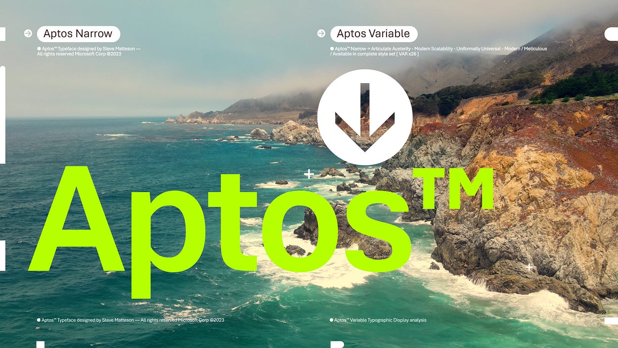
The typeface was created by Steve Matteson, one of the world’s leading type designers. His previous work includes the development of the original Windows TrueType core fonts and the creation of Segoe. Steve renamed the typeface he designed from Bierstadt to Aptos after his favorite unincorporated town in Santa Cruz, California, whose widely ranging landscape and climate epitomizes the font’s versatility. The fog, beaches, redwood trees, and mountains of Aptos summed up everything that he loved about California. Getting away from digital and evoking the outdoors was akin to getting back to pencil and paper. Drawing letters by hand would play a pivotal role in Steve’s creative process.
Si Daniels
I was aware of Microsoft’s intent to change the default font in their Office suite since they launched a campaign to gather public feedback on a short list of five fonts – it’s a bit too long ago to recall if I submitted my preferences as well. I do remember though that none of the fonts impressed me in particular, and I would have undoubtedly preferred for Calibri to remain the Office default.
Aptos, formerly known as Bierstadt, was not my first choice among those five back then. My top pick would have been Seaford, followed probably by Skeena, although these don’t seem best suited for long stretches of text in small print. But Aptos doesn’t excel in that regard either; I formatted a small Excel table with this font and it looked heavy and baroque compared to the simplicity of Calibri. At larger sizes Aptos looks more pleasing – it may well improve a lot of PowerPoint decks – but those sizes are a minute fraction of the office work done in Word and Excel.
This design process reminded me of a Twitter thread a while ago about choosing sans-serif fonts for designs. The angle of the terminals for letters like c, a, g, e, and s reflects the brand of the font, with horizontal terminals defining a crisp and clean font, angled terminals a friendly font, and vertical terminals an elegant one. I found it striking that my favorite sans-serifs all have vertical terminals, thus ‘elegant’ (the current Office default Calibri, another veteran Office font Candara, and the Windows UI font Segoe) – I also use these on my blog for caption areas and widgets. Aptos on the other hand has distinctly horizontal terminals, putting it into the crisp category; the tight apertures are probably why I consider this font heavier on the eyes compared to the others.

While writing this post I’ve found out that Microsoft has updated their UI font Segoe with a variable version, which is the new default on Windows 11. A good move, although I wish the font’s variable features would be more accessible for web design.
Post a Comment