There is no shortage of apps that analyze your Twitter account for data, digging up when you first joined Twitter, the apps used to post, etc., but that hasn’t been the case for Facebook – probably because of the higher data complexity and privacy concerns associated with it. But last week Wolfram|Alpha made their debut in personal analytics
by offering analytics for personal Facebook accounts. It’s not likely something that the general public will ever get excited about, but, than again, I’m not the general public, so I was very interested on what it had to offer.
You can get started at the dedicated page on the site or directly by searching for facebook report
or my facebook
on Wolfram|Alpha. Naturally, you have to grant permission to access your Facebook data. Unfortunately, before you get the report you also have to create a Wolfram|Alpha account – this just creates an unnecessary entry barrier for users. Furthermore, downloading charts or data requires a Pro account. You can start a trial version, but that only comes with 500 credits, which are not nearly enough to save the data from this report, let alone any other.
But putting these limitations aside, let’s see what the report reveals. It starts off fairly unimpressive, showing your profile picture and date of birth, along with some Wolfram-Alpha-style enhancements like the Moon phase and the time until your next birthday. The more interesting insights start in the next section, which analyses your recent activity on Facebook, specifically two years’ worth of updates. My activity has definitely picked up in this period, from about 10 updates per month to recent peaks of nearly 40! Further down in the report you can also find a breakdown of the post frequency by day of the week and hour.
Apparently I prefer posting links over status updates – some 52% of my updates had links compared to 44% without links; there are some months where I posted links exclusively. I’m not a big fan of photo uploads – only 19 pictures in 2 years! Very true, because as a photo enthusiast I can’t stand the way Facebook compresses photos, destroying their quality, so I prefer to share them on Picasa or Flickr – hence even more link updates! That might change as I start to upload more mobile pics from the iPhone.
Another interesting bit of information: the app used to post updates. For me the result was mostly expected: ifttt and HootSuite top the charts because I use(d) both to schedule updates on Facebook and Twitter and to share links from Google Reader.


Slightly unexpected, the analysis of the relationship status shows more of my male friends are already ‘married’ (66.7% compared to 54.7% of females), but less are ‘in a relationship’. ‘Engaged’ is not really an option apparently. But there I less data to work with here, less than half of my friends have bothered changing that field, so it might not reflect the real picture.
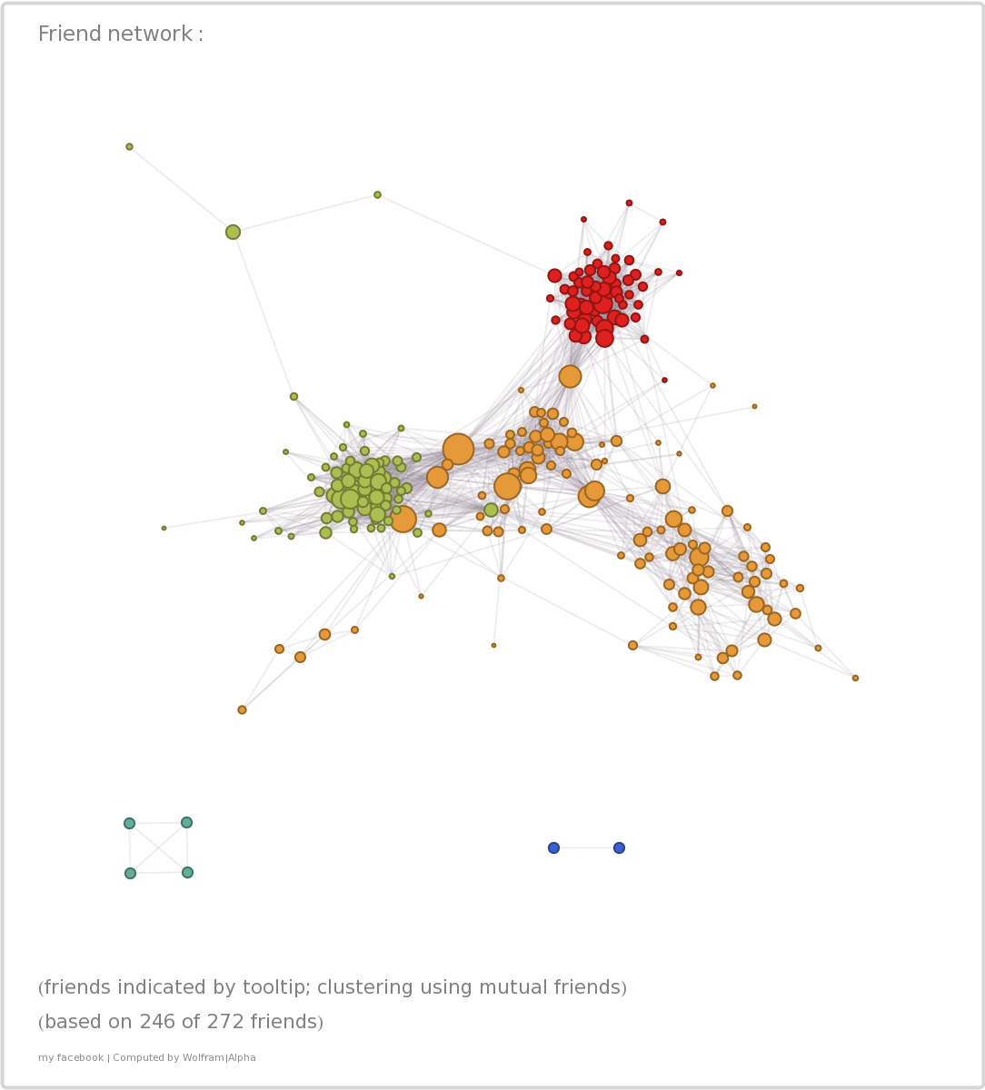
The best part comes last in the form of a graph of your entire Facebook friend network, mapped by mutual connections – these are reflected both in the overall structure of the network and in the size of the bubbles representing individual friends. It’s really remarkable how accurate this representation is, possibly because I tend to only “friend” people I met in real life – quaint, I know! There are three main clusters, two of them tighter, the third one looser. The upper red cluster represent my first job, which, being in a different field than my studies and following jobs, is somewhat separated from the rest of my connections. It connects to the loose orange cluster through a large node, a coworker from my first job who also attended the same university as me. This larger cluster covers several areas of my life, starting with my high-school years, the university and two other jobs, including the current one. But it’s still accurate because many of my high-school friends attended the same university and I met many former university colleagues later in my career. This cluster overlaps on the left side a fair amount with the green cluster – my third job – and again I can easily recognize the nodes connecting the two: former colleagues from the university that ended up working there as well. The unconnected bits on the bottom are distant family members; the tail stretching towards lower left are former childhood friends I have grown distant of; the branch trailing in the upper left has some online people that added me, so I added them back. For a computer-generated map, it’s pretty close to the truth! I would love to see a similar analysis done on other sets of data – maybe LinkedIn could be next?


Post a Comment