If you want to give it a try, maybe even considering replacing your other email apps, you should start by taking a look at the list of features Inbox doesn’t have – and maybe never will. For one there’s no support for other email providers (like in the new Gmail for Android), nor for Google Apps accounts. So business users are out of luck for now – in more ways than one, because Inbox doesn’t let you add signatures or insert your default Gmail signature. There’s also no way to select multiple messages or to manage contacts, and marking mail as spam or deleting is more complicated than in regular Gmail.
I was mildly shocked to discover that you can’t mark messages as unread in Inbox. You’re probably supposed to snooze or pin messages instead, but that’s not useful if you go back to the regular web interface: snoozed mails are archived and pins have no equivalent on the web, so you need to track those messages down by searching. Inbox also doesn’t show user labels in its app inbox, making it even harder to remember where each message is when switching back to the regular Gmail or other email clients. Personally I keep longer threads in the inbox and archive other less important messages, like newsletters and random job offers; this way I always have a quick overview of my recent conversations, should I need them. By encouraging the to-do/mark-as-done approach, Inbox breaks this, lumping important conversations together with junk-type messages in the ‘Done’ section.
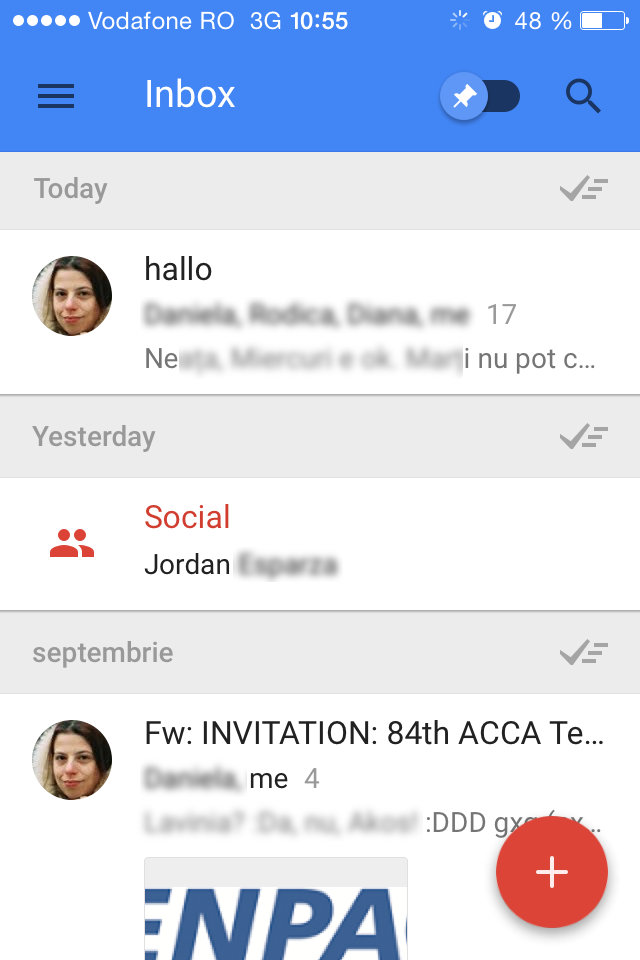
Speaking of (missing) labels, Inbox offers bundles instead, which are basically super-powered Categories that appear together in the inbox and can be marked as done with a single gesture. The idea could work for people who don’t know or bother to set up filters, otherwise it’s just getting in the way. They could start with some fine-tuning; for example Inbox it shouldn’t bundle single messages. I saw, for example, one flagged as ‘Social’, and instead of showing the subject and preview like normal unbundled mail, it only showed the sender. I had to open the bundle to see the individual message and take action, because apparently you can only mark bundles as done, not pin or snooze them. Users should also be able to change the notification times for bundles, right now there are only three, rather inflexible, options – I could understand setting a bundle for 7pm, but 7am? I’m not even awake then and why would I ever read email over breakfast?
For other suggestions, it would be nice if the ‘intelligent’ compose would suggest groups of people to email, instead of individual contacts. Inbox does a poor job of helping people compose mail to groups – basically you need to add them one by one with autocomplete. I would expect it to suggest contacts you might want to add based on the other recipients, like the regular web version already does. The app might want to fix its badge notification, for me it’s been stuck at 5 since I installed it, even though I don’t have any unread mail in Gmail.
Design-wise, the app is very polished and the bold colors look very good. There is some argument whether Google’s Material Design was inspired by Windows 8 Metro and this app offers some circumstantial evidence, namely tap-highlighting, which is used in the touch-screen version of Windows at least since the 8.1 update, if not earlier. Brian Lovin from Buffer wrote an excellent overview of the design interactions. But there are still some decisions I find annoying. First of all, the font used for message text looks too small for me and out of place on iOS (might be some Android font like Roboto?). It’s the same font Google uses in Hangouts, but I use it so rarely that it’s bearable; the same cannot be said if I’m supposed to look at it every day while reading and writing mail. The next issue is the missing support for the system-wide iOS ‘Back’ gesture. Instead, swiping right in Inbox marks messages as done; naturally I ended up archiving a couple of messages by mistake (fortunately there is a quick ‘Undo’ available). The navigation panel could use some improvement. It’s accessible only through the menu button on top-left, but as you scroll down the top bar is minimized and the menu button hidden. Navigating to other views requires you to scroll back up and reach for the button, which is probably uncomfortable on larger screens. It would be better if the menu button would ‘float’ at the bottom, like the ‘Compose’ button to the right; or if the back-swipe would bring up the navigation menu anywhere in Inbox.
A quick final note on performance: while using Inbox, the phone got noticeably warm, usually a sign that the app is making heavy use of resources. The same happens only with Facebook (notoriously bad at performance and battery life) and some games. I since disabled background refresh, but of course this does not help while the app is actively in use. I still own an iPhone 4S, so it’s possible nobody tested the older model, but even so I can’t justify draining my battery just to use a fancy email client. I’m happily going back to the native Mail app.


2 comments:
Hi , I been watching you all the time. You have a very impressive article. You should continue this way. I like your post. I want to share my own blog. Can I share?
It does seem strange that you can't mark a message as Unread.
Post a Comment