I haven’t changed the look of my blog in a long while, longer than a year, possibly even two, but I’m still experimenting with several ideas and am interested in new design options. I recently read a thorough overview about CSS columns and tried to see if I could use this to improve my blog. The advantages of columns are straightforward: with a simple syntax – without media queries and complicated breakpoints – it provides an easy way to create responsive designs. You only need to define the minimum width and the maximum number of columns and the browser will arrange the content to fit the available screen size. At the same time it provides a simple way to optimize line length for readability.
Unfortunately, reformatting large texts into columns has some limitations and drawbacks. The first that stands out, both in the examples on CSS-Tricks and in my own tests, is the undesired effect of splitting paragraphs into separate columns, with the beginning of a block of text at the bottom of one column and the ending at the top of the next. This interrupts the natural reading flow and can be very frustrating, especially on larger screens where columns are most effective. It would be more comfortable for readers if columns would only break between paragraphs, even if the content is no longer distributed evenly between them.
There is a solution for this issue in the proposed CSS3 columns spec: it defines several properties that allow webdesigners to better control the behavior of columns. For this case, break-inside is particularly useful: setting this property to avoid will force columns to avoid breakpoints inside those elements, keeping blocks of text together in a single column. At this point it’s supported unprefixed in Internet Explorer beginning with version 10 (it was also available in Opera 12 before they switched to WebKit/Blink), Chrome and Firefox use alternate properties with their specific prefixes: -webkit-column-break-inside and -moz-column-break-inside.
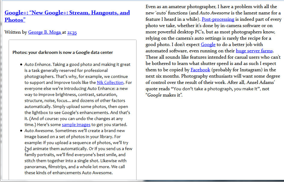
In the example below, I copied the text of one of my older article and applied some basic CSS formatting to generate the columns. As you can see, the longer blockquote overflows into the second column, making it difficult to follow the text.
article {
-webkit-columns: 2 25em;
   -moz-columns: 2 25em;
        columns: 2 25em; }
header {
-webkit-column-span: all;
   -moz-column-span: all;
        column-span: all; }
Changing the break-inside value improves the layout, keeping the quoted text together in the first column:
blockquote, p {
-webkit-column-break-inside: avoid;
   -moz-column-break-inside: avoid;
break-inside: avoid; } 
For some reason, Firefox doesn’t yet support the column-span property, so the headers are forced into the first column instead of spanning both:

If you write even longer articles, another problem with columns becomes apparent, one that is more difficult to fix. As columns become taller and taller, at some point they will grow beyond the visible area of the browser window, forcing the reader to scroll down to finish a column and then to scroll back up to continue reading the next. You could specify a maximum height for columns to avoid it, but determining what that value should be on different devices and screen sizes is tricky, short of using JavaScript. Another possibility would be to embrace the column layout completely with something like CSS Figures, but that is currently only a concept and isn’t implemented in any browser, not even in experimental form. The way I see it, using columns in articles with widely different lengths and structures (I haven’t even tested how images and videos would fit in) is more trouble than it’s worth.
This isn’t to say columns aren’t useful in limited situations, where you can control the content length better and variable height is not a big issue. Various widgets and sidebars with additional information are a perfect place to experiment. I am already using columns in my Blogger archive widget: a ‘flat’ list was becoming uncomfortably high and using columns cuts it by two. If the archive is placed in the footer, you can also consider another setup, with fixed height (for example 12em should show 12 months in each column) and unlimited number of columns, allowing the list to grow laterally as more months are added. Another interesting possibility is to use columns for the home page: on wide displays it would show 2-3 articles side-by-side, using the available space more efficiently than a single column layout. Here the height issue is less important, since only the opening paragraphs of articles are visible, the sections are thus shorter and less likely to force people to scroll back and forth to read an excerpt.
Post a Comment