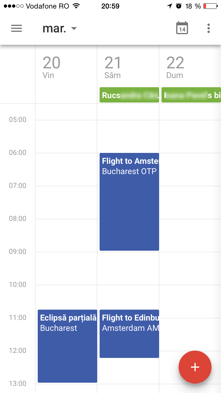
Today we’re bringing the new Google Calendar to iPhone.
Just like on Android, you’ll get the following features:
Robin Züger
- Events from Gmail, which turn emails into Calendar events automatically
- Assists, which make suggestions that save you time creating events
- Schedule View, which makes your calendar easy to scan and lovely to look at

But now for the downsides:
- First of all, the app ‘suffers’ from the same shortcomings of every other Google apps on iOS. I’ve mentioned them in my review of Inbox as well: it uses a custom font that looks small and heavy compared to the system default and it ignores wide-spread gestures like swiping to go back.
- The app icon is stuck on the date of 31, as opposed to the built-in app, which updates it’s icon to reflect the current date – one of the main reasons it’s still on my homescreen.
- Some interactions are not exactly intuitive: on the top right there’s an icon showing the current date. It’s not exactly obvious that tapping it will bring you back to today – a proper label would be clearer. The month view, the most used by me, is always a tap away and, even worse, there’s no way to keep it permanently open; once you tap a date, the calendar jumps there and closes the monthly calendar. Also, while in the month view, there’s no indication how to switch to another month (hint: you need to swipe left/right). This uncovers another design flaw: if you need to quickly check a date years away, there’s no easy way to get there! The iOS Calendar is more helpful in this situation with the yearly view where you can quickly scroll through multiple years.
- And, last but not least, there’s no landscape mode! While I (and many people) seldom use phones in landscape orientation, it would be a good way to explore other design decisions and surface information hidden in portrait.
Bottom line: Google Calendar is beautiful, but it falls short in many situations, so for me it won’t replace the default Apple app. This decision has more to do with the way I use calendars than its features. I rely mostly on the notifications I get on the iPhone about upcoming events, and for that I don’t need to use an extra app, as long as the iOS calendar can sync Google Calendar events.


Post a Comment